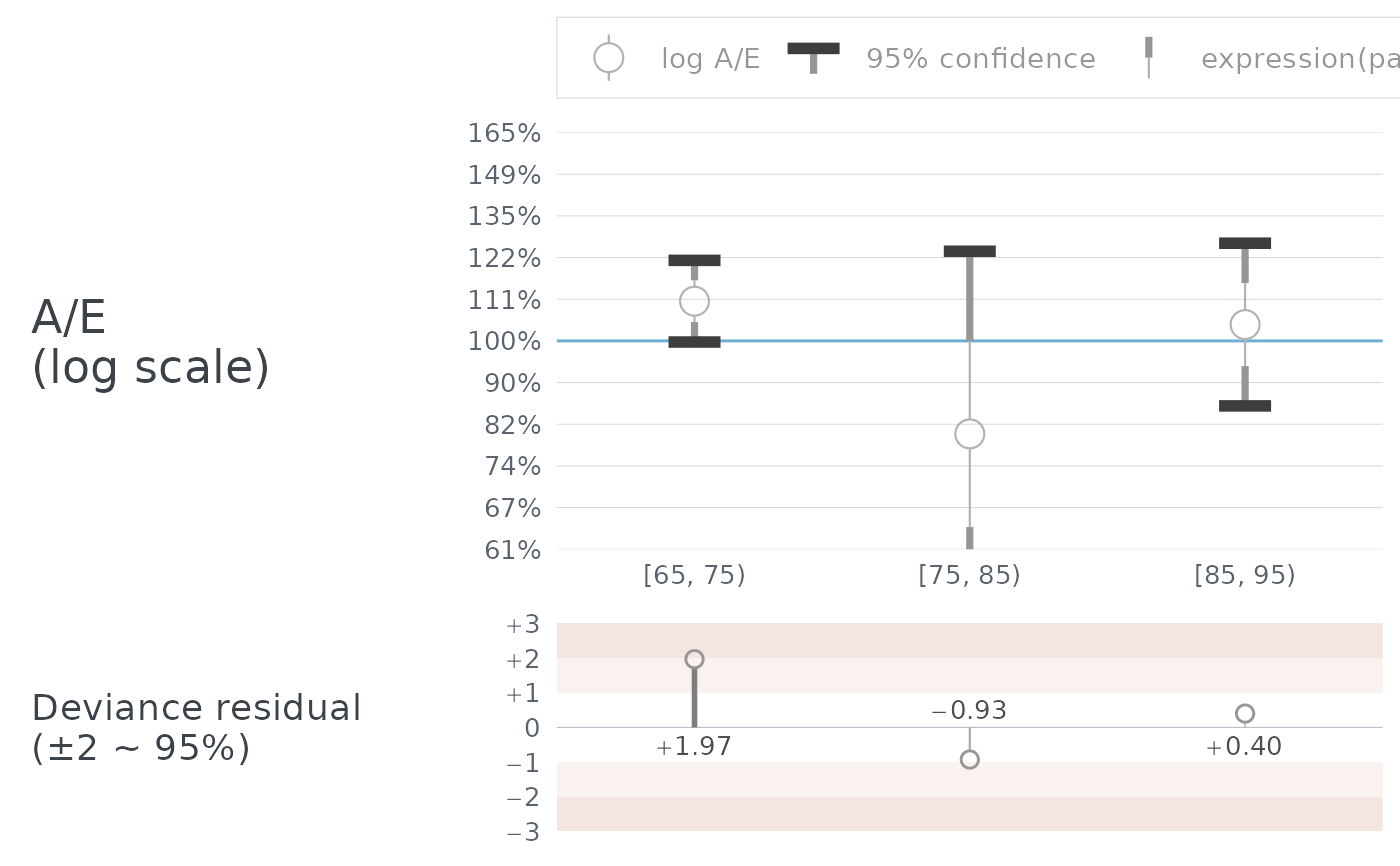
The theme autoplot.aev() draws with. Adding it back at a different
base_size is how a logmu chart is resized.
Details
Every length on the chart is a multiple of the base text size – the marker and its interval, the off-scale chevrons, the depth of the residual strip, the group brackets and the legend key. So a chart drawn for a larger page wants larger type, and gets everything else with it:
A larger device on its own does not do this. It gives the same marker in more room, which reads thinner and smaller the further it is stretched.
ggplot2::theme(text = ggplot2::element_text(size = 13)) resizes most of the
chart in the same way and is the ordinary ggplot2 way of asking. It
cannot reach the legend key, which is sized by legend.key.width and
legend.key.height and so only by this function. Where the legend matters,
use theme_aev().
The result is an ordinary theme and can be extended with + like any other.
Adding a standard theme
Replacing this one wholesale – with ggplot2::theme_minimal(), say – still
draws a chart, and rather more of one than you might expect. The two panels,
the group brackets, the off-scale chevrons, the depth of the residual strip
and the sizing all survive, because the facet builds them and not the theme.
What is lost is the styling the design asks for:
Grid lines come back in the residual panel, where the prototype deliberately has none – the edges of the tint bands do that work, and they fall in the same places.
ggplot2::theme_bw()andggplot2::theme_grey()restore the tick marks too.The panel titles are facet strips, so they revert to being rotated upright and centred inside the panel instead of lying flat beside it.
The type goes from 9 points to 11, which takes every mark on the chart with it – markers about a fifth heavier, and a residual strip a fifth deeper.
None of that is an error, and nothing is overridden: a chart is entitled to
be restyled, and + winning is the whole of ggplot2's contract. But the
chart does say so. It signs its own theme, notices when the signature has
gone, and warns once as it draws:
Only a COMPLETE theme clears the signature. ggplot2::theme(...) merges, so
ordinary customising never trips it. Adding theme_aev() after the standard
theme puts the styling back and silences the warning.
See also
aev_plot for the chart itself.